Having previously worked on a redesign of their Sixth Form prospectus and developed a new visual scheme for their SCITT, NMAPS, we understood the competitor landscape and positioning.
Wycombe High School is a thriving place – exam results and league tables spoke for themselves. However they needed more than just academic achievement to showcase this to prospective parents.
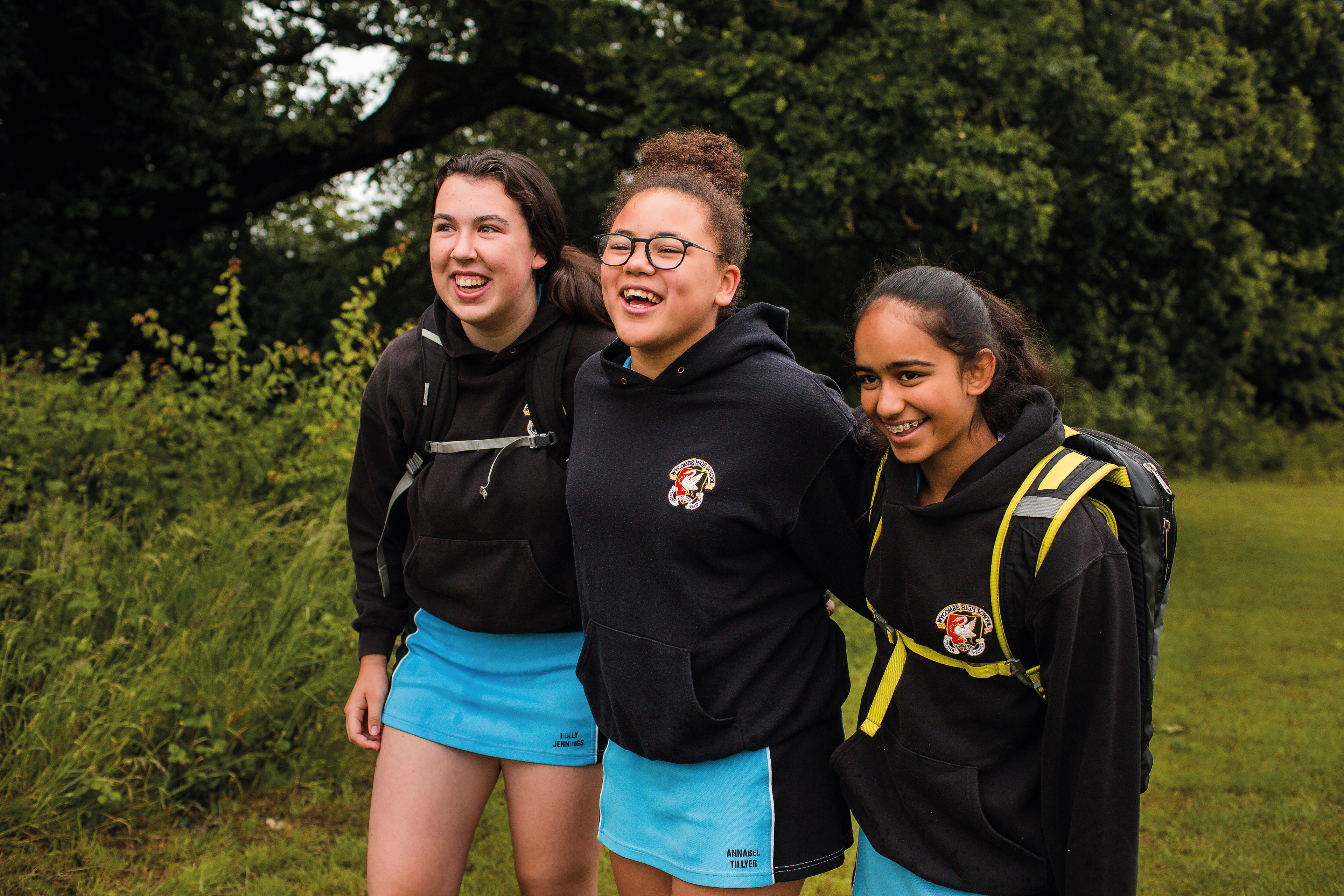
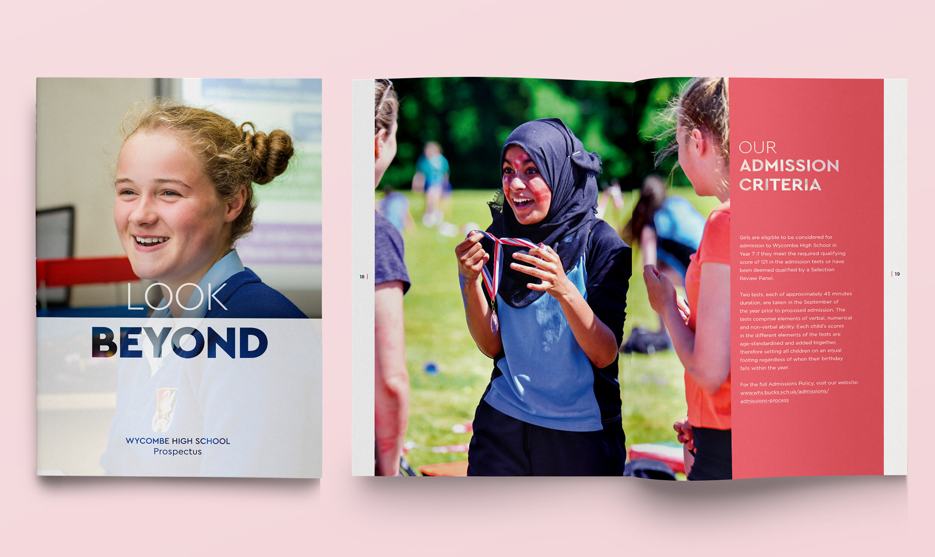
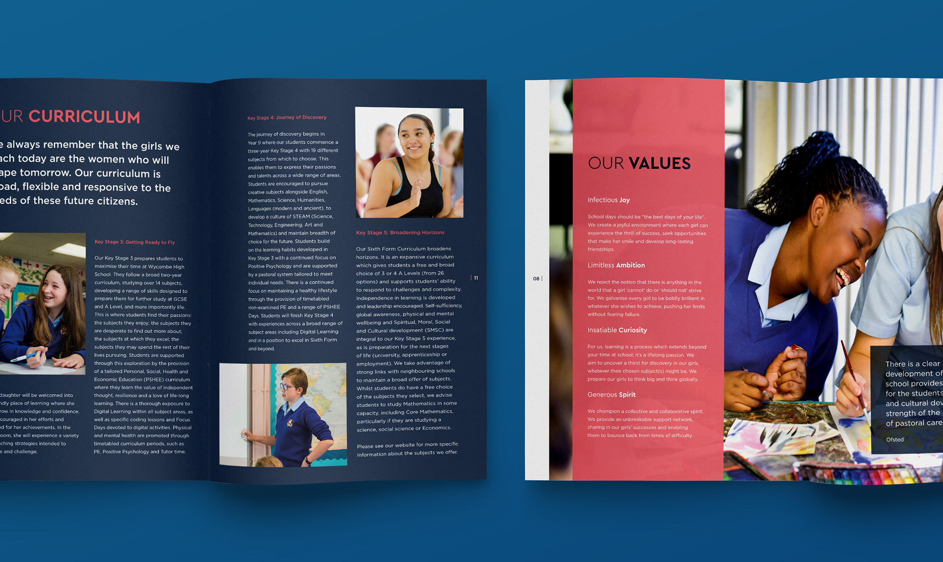
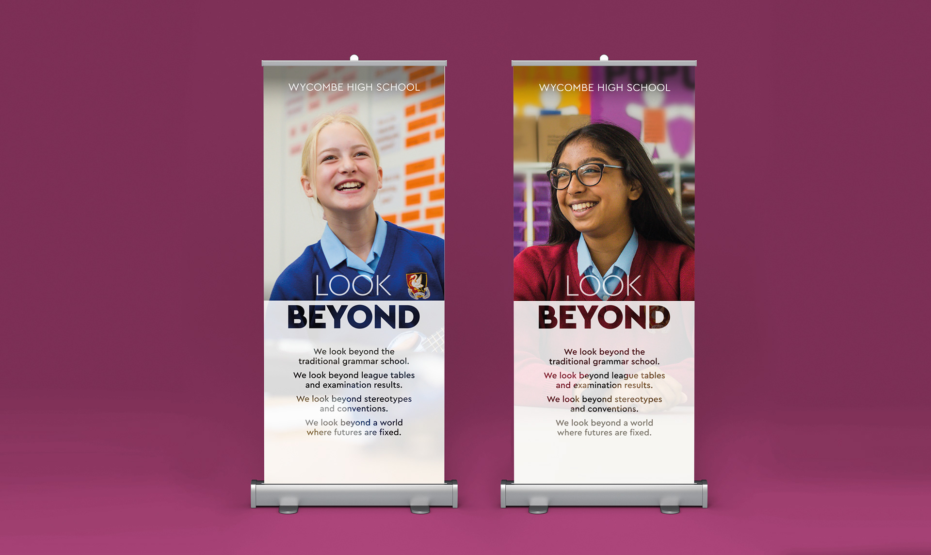
We placed the girls at the heart of the design. By creating an impactful, simple, photography-led identity. We commissioned a photoshoot at the school, capturing images of the girls expressing joy, pushing their limits and experimenting with activities which challenge stereotypes and convention.
We chose a typeface which is modern and unfussy, to reinforce the school’s forward-thinking approach to education and inclusivity, and introduced a new graphic device. The frosted filter with contrasting transparency and opacity nodded to the ‘Look Beyond’ brand thought.