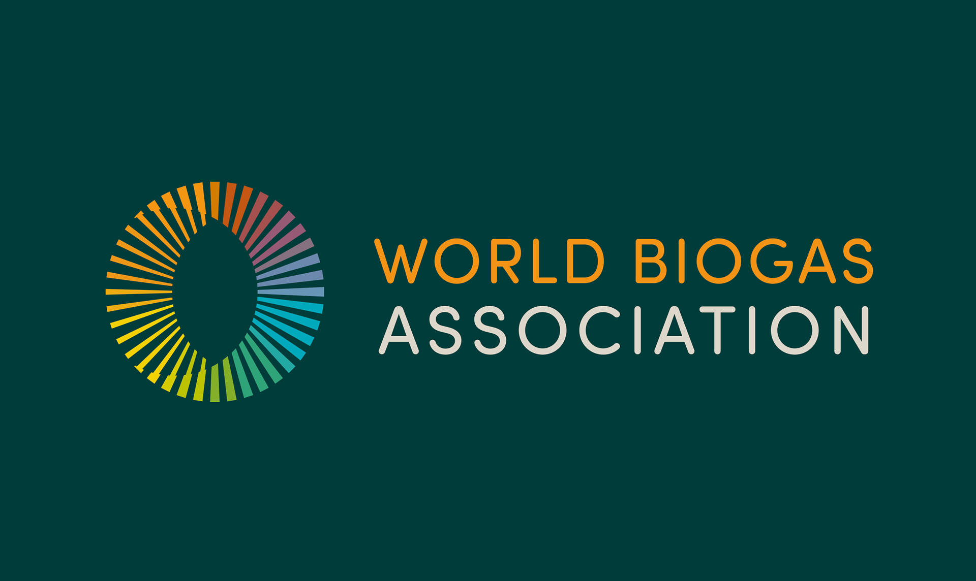
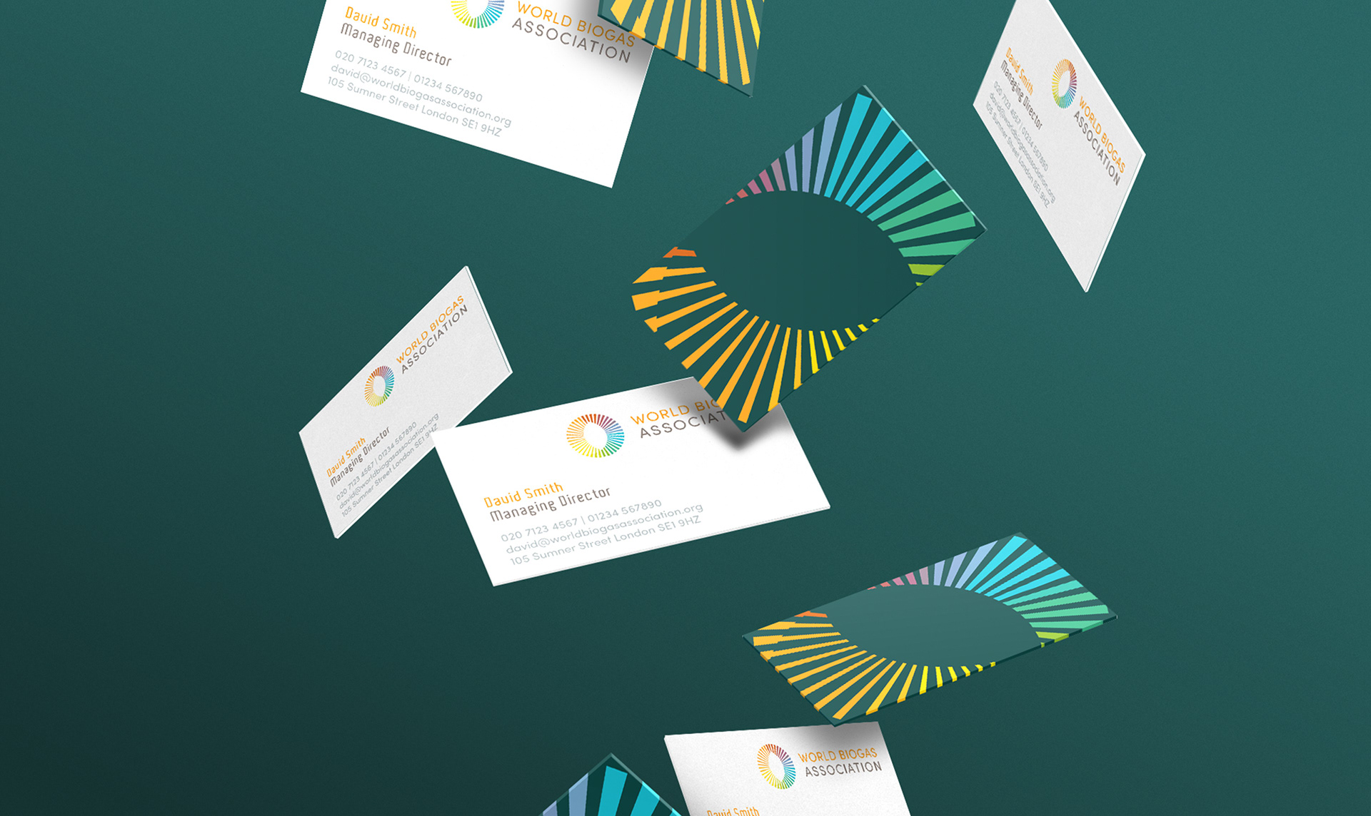
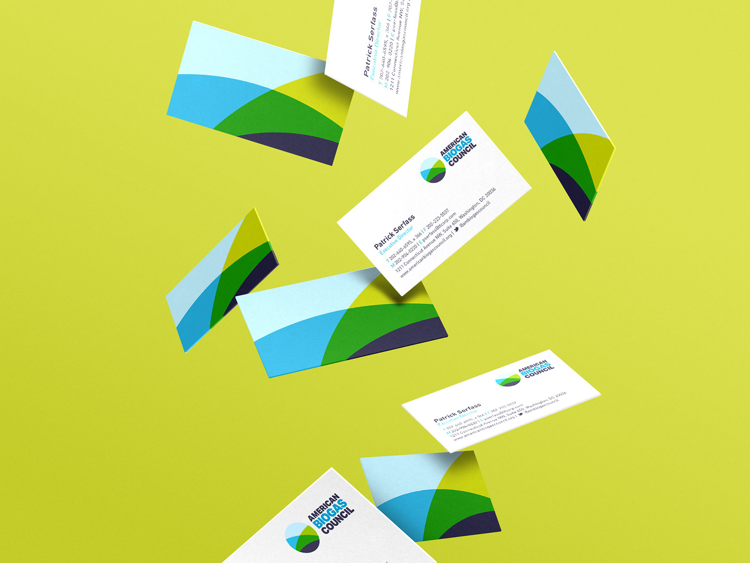
The client wanted a new visual identity that demonstrated positivity, hopefulness and energy. We created a marque that is dynamic with a subtle nod to the process of anaerobic digestion, while adopting a bright colour palette that is positive and reflects the wide reaching industry.
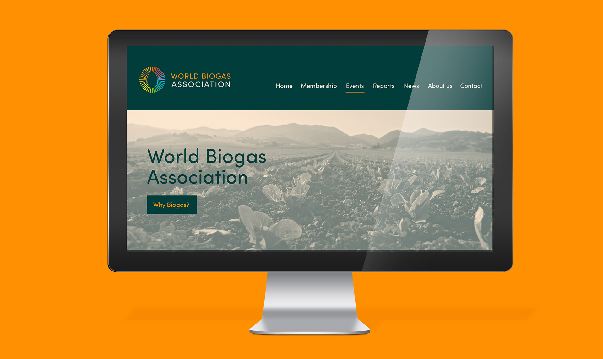
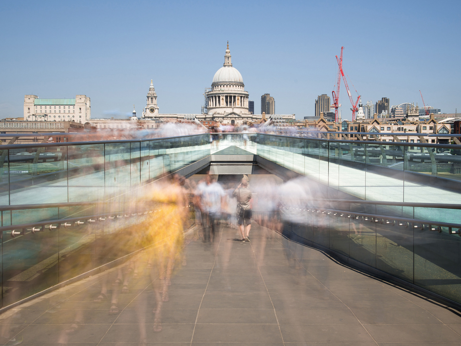
The typeface was intended to feel professional yet have character and definition. We adopted a photographic rationale that moved away from the literal to one that felt more aspirational, supporting the industry's drive for respecting nature and using it in a sustainable way. To create a greater sense of ownership, we applied a filter over the images.