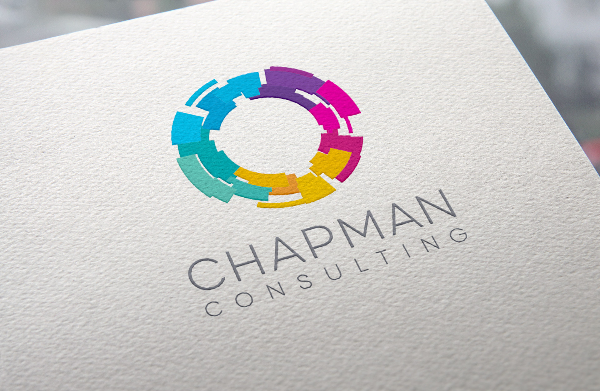
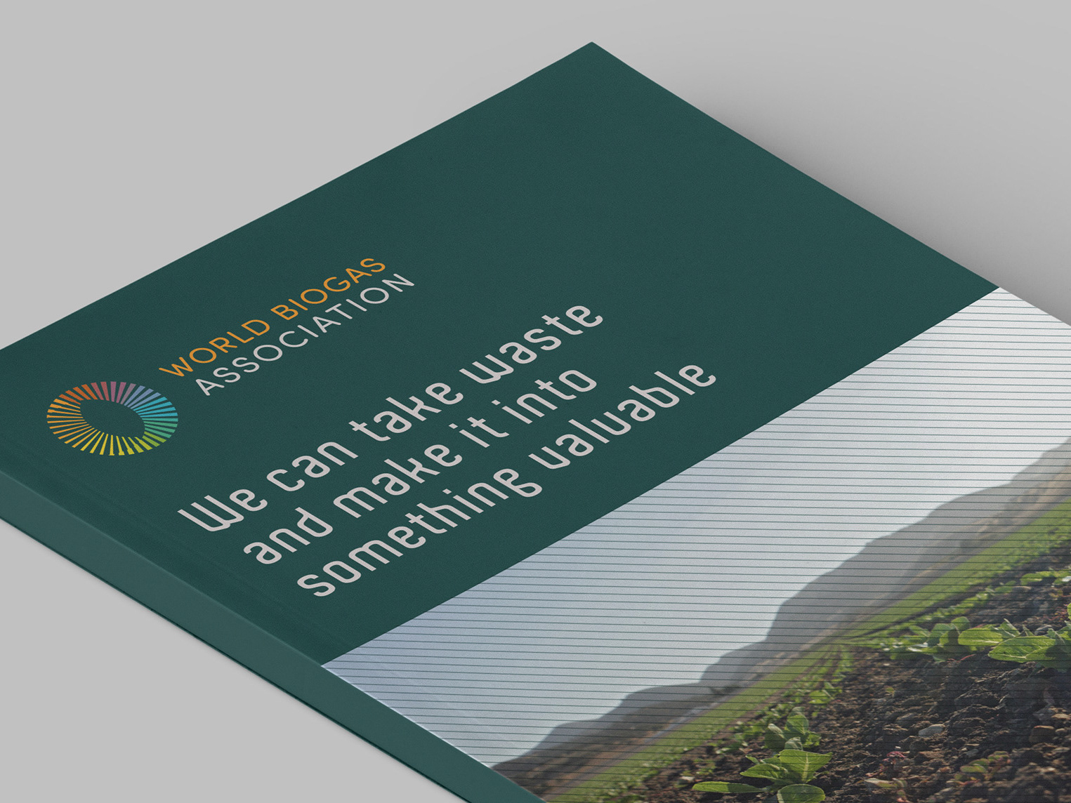
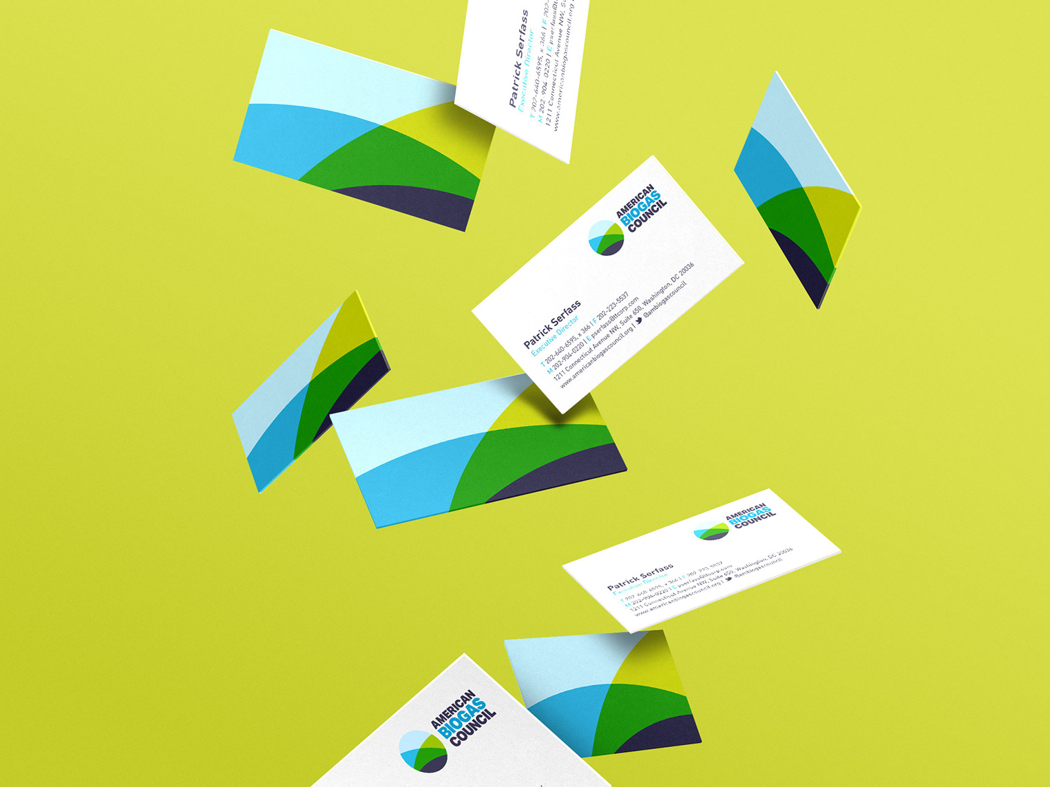
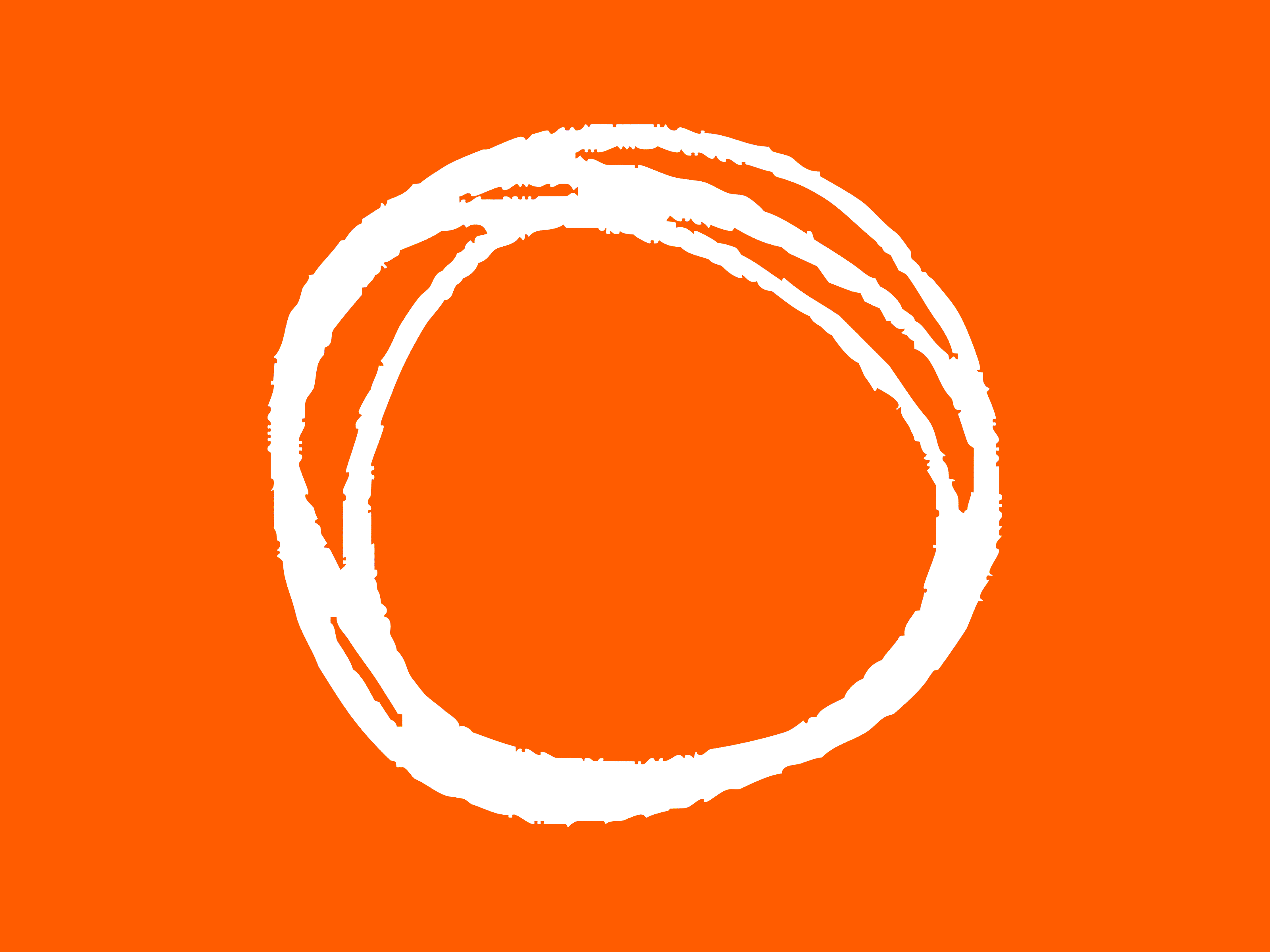
Their USP is the unique journey they take their clients on with a five stage process. This was key to the brief when they asked us to help them with a new identity.
We achieved this by creating a circular bold shape for the logo marque that was suggestive of a process and then we incorporated a bright colour palette for the five areas.
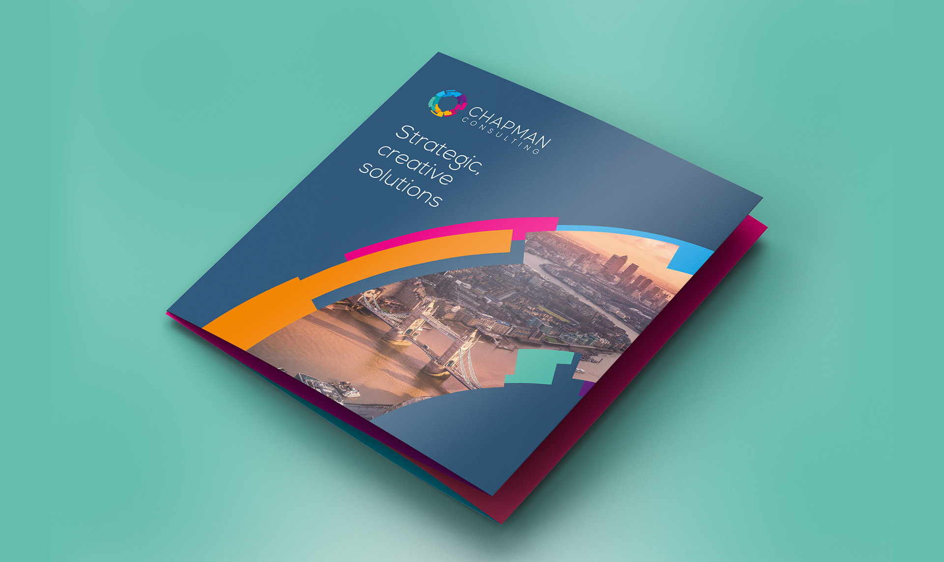
The bold shape enabled us to use it as a graphic device across the brand materials to hold imagery and colour for interest and ownability.